Visual narratives: From science to engagement through the European State of the Climate
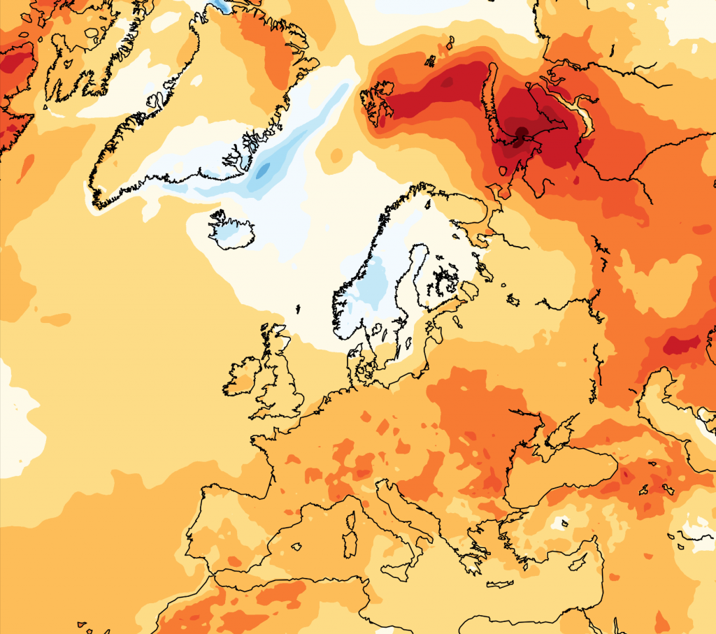
More than just colorful maps and eye-catching graphics. Data visualization enhances the readability of complex data, engages broader audiences, and sparks interest in the “state of the climate”. Anna Lombardi, climate data visualizer at the Copernicus Climate Change Service (C3S), offers insight into what’s behind visual narratives for climate trends. Through innovative data visualizations, the latest C3S report enhances accessibility and engagement with climate science across all audiences.