The beauty of a weather report is that it delivers a daily, or even hourly, update on what to expect in the near future, turning complex data and forecasting models into simple visualizations that anybody can interpret and plan their day around.
In contrast, charts, graphs and representations of climate science data can often feel overwhelming. Sure, delivering a weather forecast and providing a window onto climate change are completely different endeavors – not least of which due to the timescales involved – yet data driven stories about climate change can still draw in a broader audience if presented in an accessible and engaging fashion.
“Science and communicating science work on very different timescales. The scientific process, for better or for worse, takes a long time and it can take years for research papers to get published,” explains Zack Labe, whose colorful and captivating Twitter feed feels more like a daily weather report than snapshots of complex climate data.
Born from a passion for meteorology and a desire to reveal the climate change signals hidden in complex data, Labe explores the connections between climate change and extreme weather in both his research and his climate change communication on Twitter, where he now has over 45,000 followers. Not bad considering that he shares graphs and charts about climate change!
“I share these visualizations because I realize that not everyone wants to deal with data, but they still want to be part of the scientific process,” explains Labe, “I call what I am doing data driven stories and consider myself a storyteller in my own right. We need to move away from this idea that there is one pre-set model for climate change communication.”
A look at the loss of thicker (usually older) #Arctic sea ice in Octobers from 1979-2016 (PIOMAS, ice < 1.5 meters masked black) pic.twitter.com/BtHCwVUdKk
— Zack Labe (@ZLabe) November 14, 2016
What is the main focus of your climate change research?
I’ve always had an interest in the connections between climate change and extreme weather and my research boils down to a process of detecting climate change signals. I like to think of it as the weather and climate systems being the really noisy day-to-day, even year-to-year, and I am trying to find the climate change signals within that noise.
For some variables such as temperature and warming it’s easy, but for others, like changes in storm activity, it’s more challenging. My research is basically about using a lot of different methods to find these climate change signals in amongst all the variability. For example, in my research on the Arctic I started out by focusing on how Arctic climate change affects weather at other latitudes.
Similarly, my current work at Princeton University and NOAA Geophysical Fluid Dynamics Laboratory is centered around the idea of climate attribution and therefore the relationship between extreme events and climate change.
What inspired you to start making the engaging data visualizations that you share on Twitter?
I would say that there are three main sources. To begin with, my long standing passion for meteorology. As a kid I would stand outside during blizzards or stay up all night watching thunderstorms. However, the timescales for weather forecasting are different from climate science: meteorologists show up on your television every evening or multiple times per day, but delivering the weather forecast and providing a window onto climate change are two very different processes.
For example, sea ice has a seasonal cycle where it grows in winter and melts in summer, and therefore reaches a maximum and a minimum twice a year. For most media outlets these maximum and minimum points might be the only two stories they feature about sea ice all year. Yet there are many other extreme events happening throughout that same time period.
Secondly, during my postdoc in Colorado, I started exploring the use of machine learning type techniques. People often say that machine learning is a black box where you sort of throw in data, which is processed and then churned out as a prediction, without really understanding how it all works. However, the computer science world has developed new visualization methods to really understand what the machine learning models are looking at.
When I was focusing on Arctic research I read through a lot of papers that were detailing dramatic changes in the region. However, I found that I really couldn’t understand a lot of the graphs and that they were displayed in a way that was not very accessible to non-experts. I turned to visualization methods to see if I could gain new insights on climate science and detect climate change versus climate variability both on the large scale but also specifically to the Arctic.
Finally, one of the problems with communicating climate change is that not every year is a new record. This leaves space for misinterpretation or misrepresentation of information, particularly if you don’t provide the whole picture and underlying trend. With my data visualizations I am looking for a way to improve communication and show long term trends in climate science in an engaging fashion.
Do you find that people are interested in the data?
The issue is: how can we communicate complex climate data? How can we make it more accessible with improved visualizations that follow it more quickly and give real-time updates? Just like weather is an everyday conversation starter we can turn climate change into a conversation starter by using engaging data visualizations.
I started by taking sea ice data and giving my own twist to graphs, quickly realizing that there is a huge interest from people from all around the world that want to know more about the data itself. At the same time not everyone wants to deal with the raw data directly whilst still wanting to be part of the scientific process. My entire goal is to bring the scientific process to everybody by providing the data, showing how I visualized it and finally including a link so that anyone that is interested can find it.
When communicating climate change there is sometimes a fear of accepting variability as this can easily be manipulated to spread misinformation. How have you dealt with this?
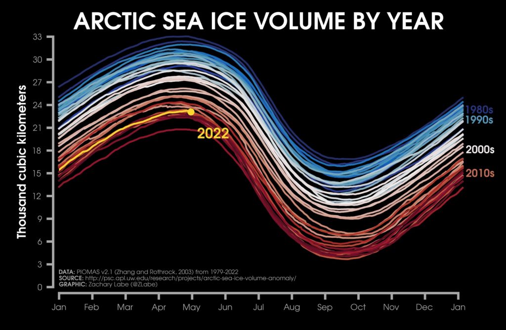
There is certainly a hesitancy to talk about uncertainty and variability. However, I like to share graphics that don’t hide variability. I like to think that 90% of my graphics have two major points: the trend in the data, which is the climate change signal, and that there is variability.
I just recently posted one that got significant attention on social media, which looks at sea ice thickness and its anomalies for every single day since 1979. The colors clearly show that it’s thinning on every single day of the year. But there’s also this shading of the color which shows that there’s variability. This is an example of how we can show variability, but still clearly reveal the overall trend.
#Arctic sea ice thickness anomalies for every day since 1 January 1979 – can it get any more obvious? 🥹
+ New visualization now available at: https://t.co/uzWknW5cwp pic.twitter.com/c8Y3fbk2Vz
— Zack Labe (@ZLabe) June 5, 2022
When we’re talking about climate change, we’re focusing on trends, not on the day to day. Extreme events are what make the headlines but as a climate scientist, I want to understand what is causing the extreme events. We should always emphasize the long term trend because that’s the key point.
Is there a direct relationship between the data visualizations you share on Twitter and your research?
For some people, it’s really effective to see an animation with changes over time. For others it may be heat maps where you just throw all of the data out there and try to make it presentable without adding a trendline or smoothing out the data, literally portraying the raw data.
I simply take lots of the same data sets and make different graphic versions that appeal to different audiences taking on feedback that helps me improve my visualizations so that they are more accessible.
Science and communicating science work on very different timescales. The scientific process, for better or for worse, takes a long time and it can take years for research papers to get published.
At the same time climate change is proceeding at a different pace, especially in an area like the Arctic. A researcher may be focusing on one year in the Arctic or even just a record low sea ice level in one region. And then, while the research is still ongoing, there may be a new record and the paper still hasn’t been published. As I said, totally different timescales. The relationship between my communication and my research is that it works on these different timescales.
I just published a paper which uses ocean heat maps using machine learning to predict whether the next decade would be a slowdown in the global mean surface temperature. This research idea came from feedback received on Twitter and climate misinformation about there being no increase in the global temperature over the last couple of years, what has been dubbed the “global warming hiatus”. If we can predict these kinds of slowdowns ahead of time then we can tackle misinformation about what is causing them.
The same goes for extreme events and attributing them to climate change. When I report extremes in real-time on my Twitter feed I am very careful about attributing them to climate change, yet behind the scenes I research and study that very relationship. I like to think that the two worlds build upon one another.
How do you deal with misinformation and social media users potentially using your visualizations inappropriately?
My graphics have definitely been used inappropriately both to deny climate change and increasingly to claim that we are doomed and that tipping points have been reached, which is not always the case. There has definitely been a change in the online trolling comments, which are increasingly coming from people who believe we are doomed and accuse climate scientists of hiding how bad the current situation is.
When I first started I very much interacted with misinformation. But now, I simply don’t interact anymore. I think the most powerful button on Twitter is the mute button and I wish more people would take advantage of it.
What do you think is missing in the way climate change is being communicated?
What I dislike about the climate change communication discourse is the mentality whereby you have to do it a certain way. The consensus is that you should stick with human driven stories and not throw facts and numbers at people. Initially, I was concerned because I was doing quite the opposite: throwing facts and numbers and graphs at people all day long.
Now, I call what I’m doing data driven stories and consider myself a storyteller in my own right. We need to get away from this idea that you have to do climate change communication in one pre-set way. I always encourage people to communicate, however they feel they can be most effective. Lately, there’s been a whole world growing on TikTok for climate change communicators which is wonderful, even though I don’t foresee myself creating TikTok videos anytime in the future.
Cover image: detail of an animation taken from: https://sites.uci.edu/zlabe/arctic-sea-ice-figures/
“A look at September Arctic sea ice concentration over the last 100 years (through 2017) using the latest NSIDC SIBT gridded 1850- reconstruction from Walsh et al. [2016]. The discontinuity between 1978-1979 is the transition to the passive microwave satellite era.”
 Zack Labe is a postdoctoral researcher working at NOAA Geophysical Fluid Dynamics Laboratory and the Atmospheric and Oceanic Sciences Program at Princeton University. His current research interests explore the intersection of climate variability, extreme events, decadal prediction, and data science methods. His highly engaging data visualizations can be found on Twitter @ZLABE.