Complex problems, like the climate crisis, need solutions. Climate solutions need knowledge and information that come from science and data.
To have an impact, climate information must reach those who have the opportunity and power to enact a more sustainable pathway: the multifaceted forms of science communication must be tailored to reach specific audiences that in turn can develop and apply strategies to cope with climate change.
Co-designing communication with content experts and users, keeping in mind the audience and their needs from the start, is a key step in building engaging and understandable narratives, making complex information more accessible to a broader audience, as well as empowering specialists and non-specialists to make informed decisions about the big challenges we face as a society.
Visualizing climate change
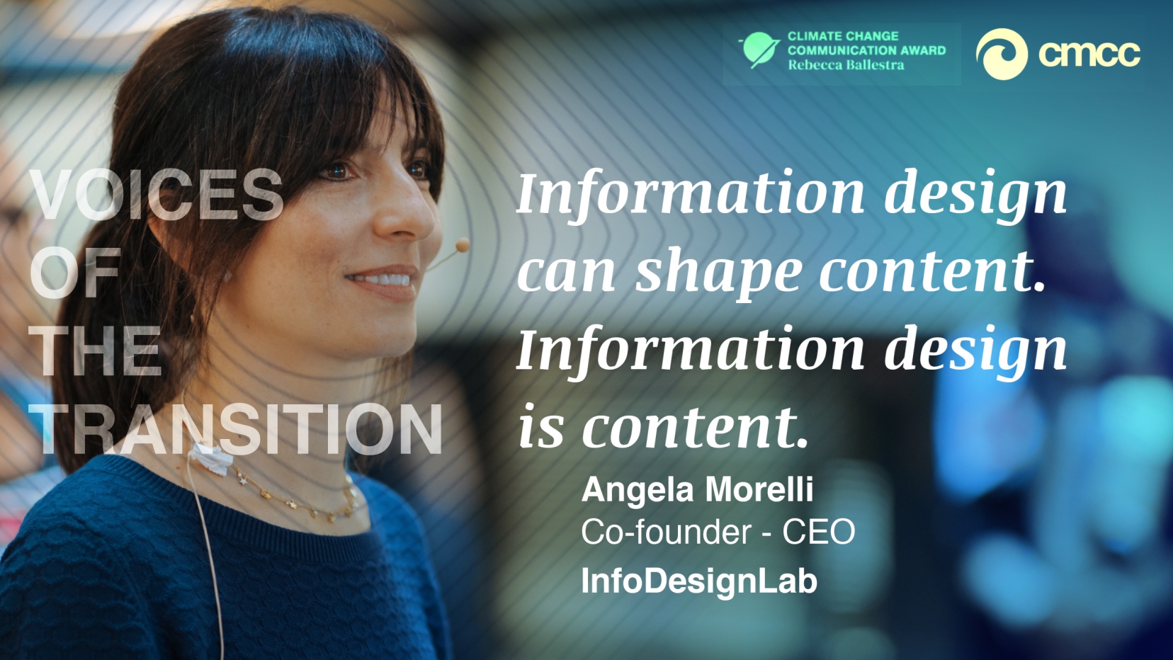
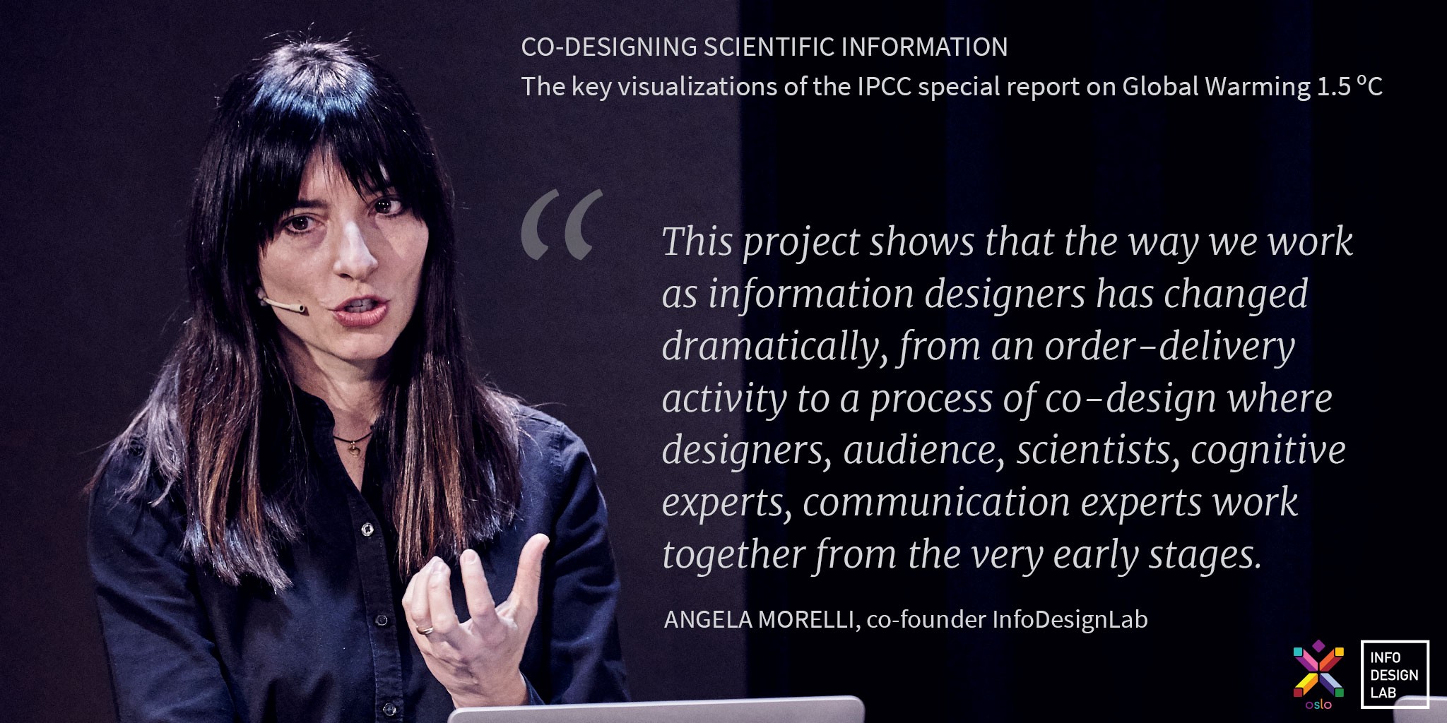
“About 15 years ago I started diving into climate science and I understood the urgency of environmental issues and the importance of critical thinking. I decided that I would knock on the door of research organizations advocating for a new way of visualizing data in a design-driven way. In a human-centered way.” Engineer by background, Angela Morelli is an award-winning Italian information designer based in Norway, with a profound passion for the environment.
Morelli’s interest in science communication brought her to co-found, together with Tom Gabriel Johansen, the information design firm InfoDesignLab, through which they develop solutions that can help audiences understand complex topics or support evidence-based decision making. They do this by supporting companies and organizations turn complex data into meaningful narratives, unique visualizations, and compelling messages. With data visualization, they provide insight into complex datasets by communicating their key messages through graphical representation of information, with the goal of moving from data to knowledge and action.
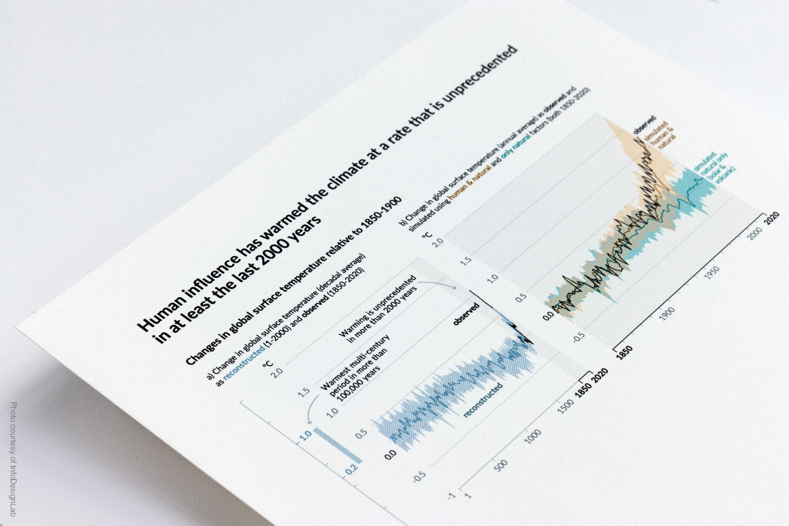
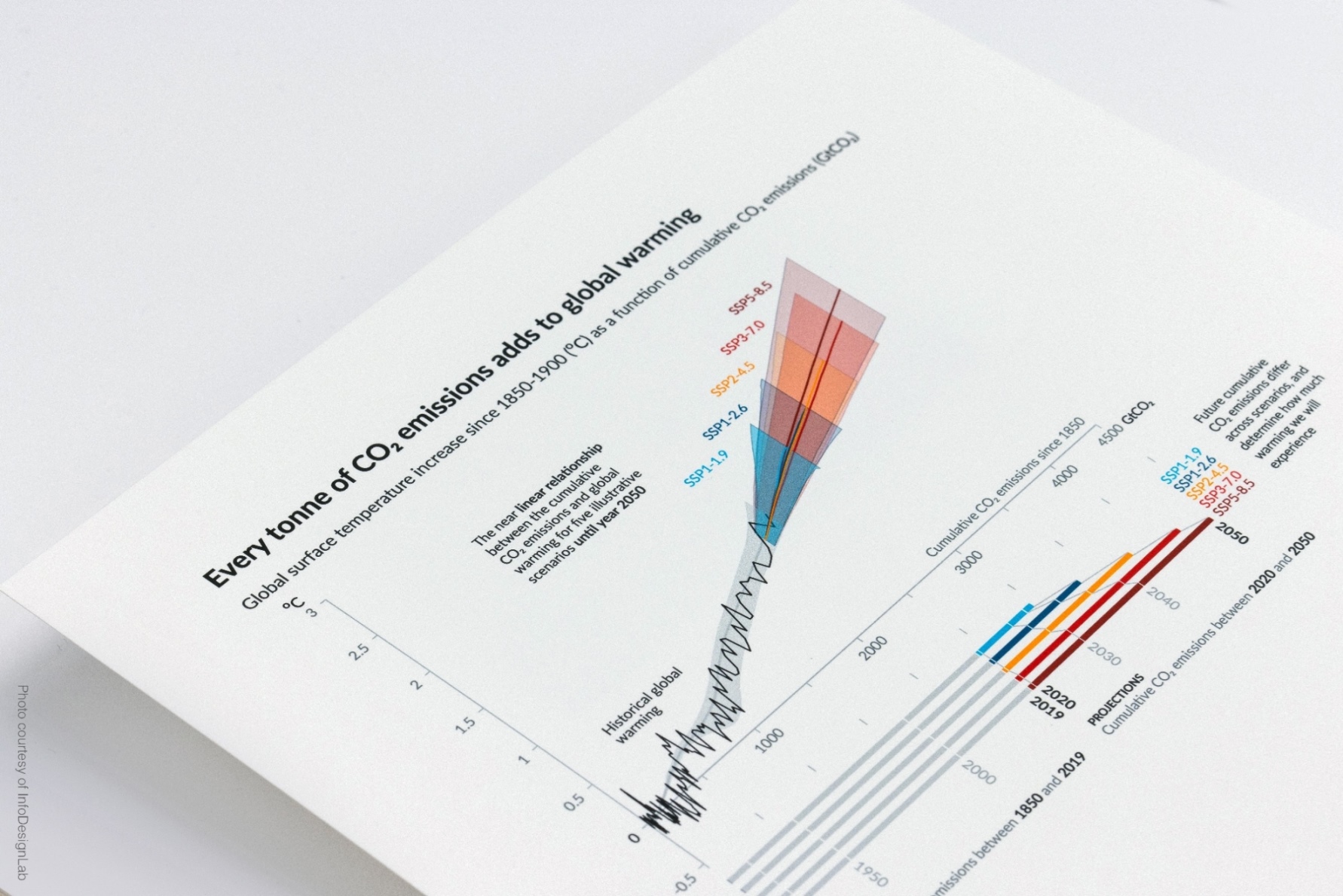
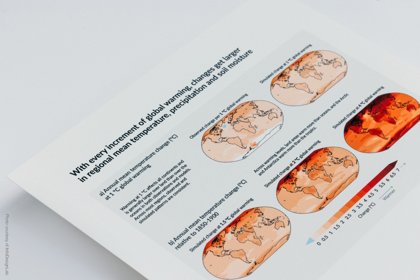
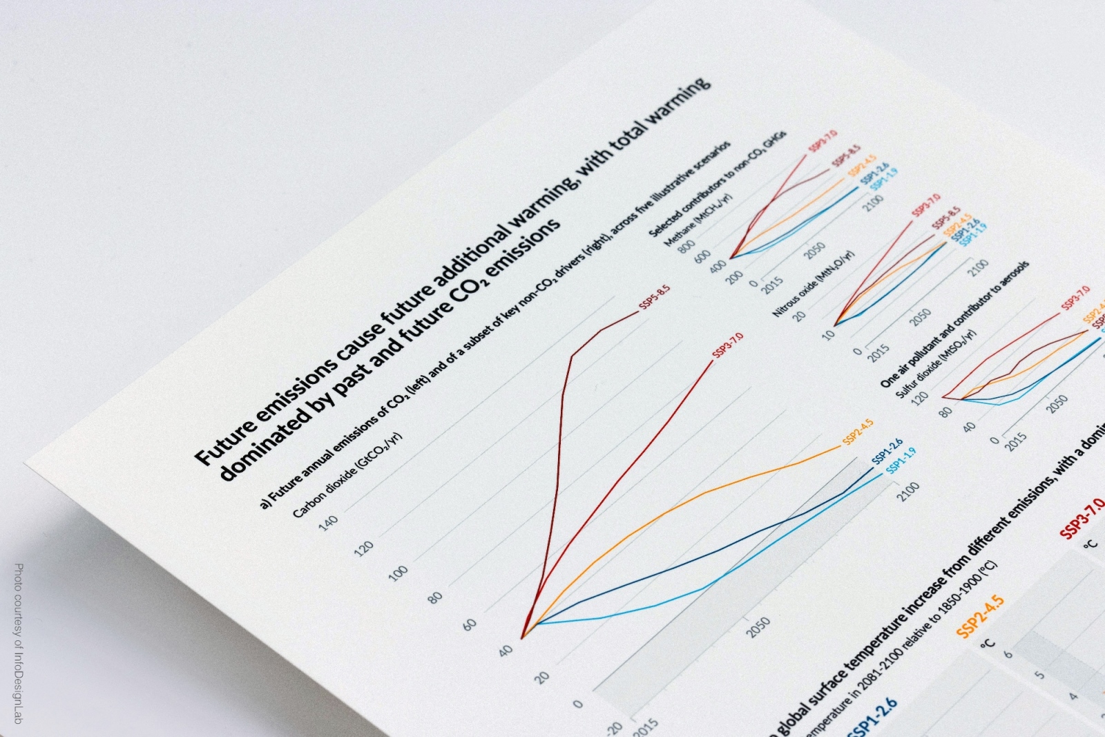
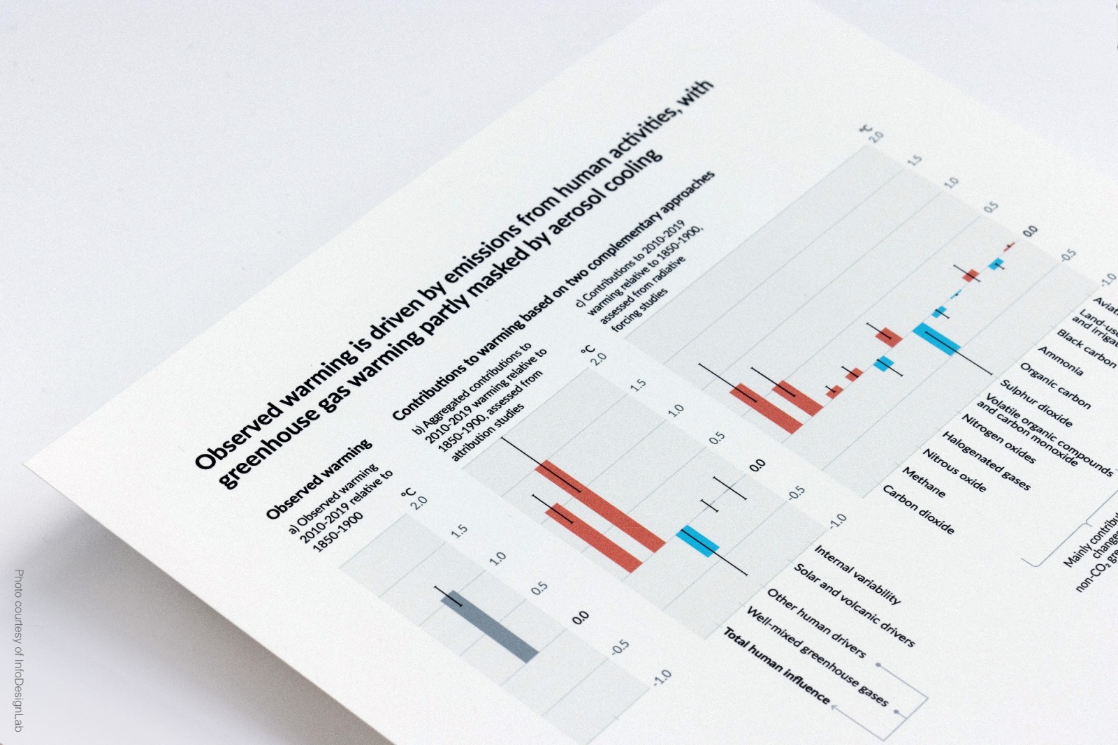
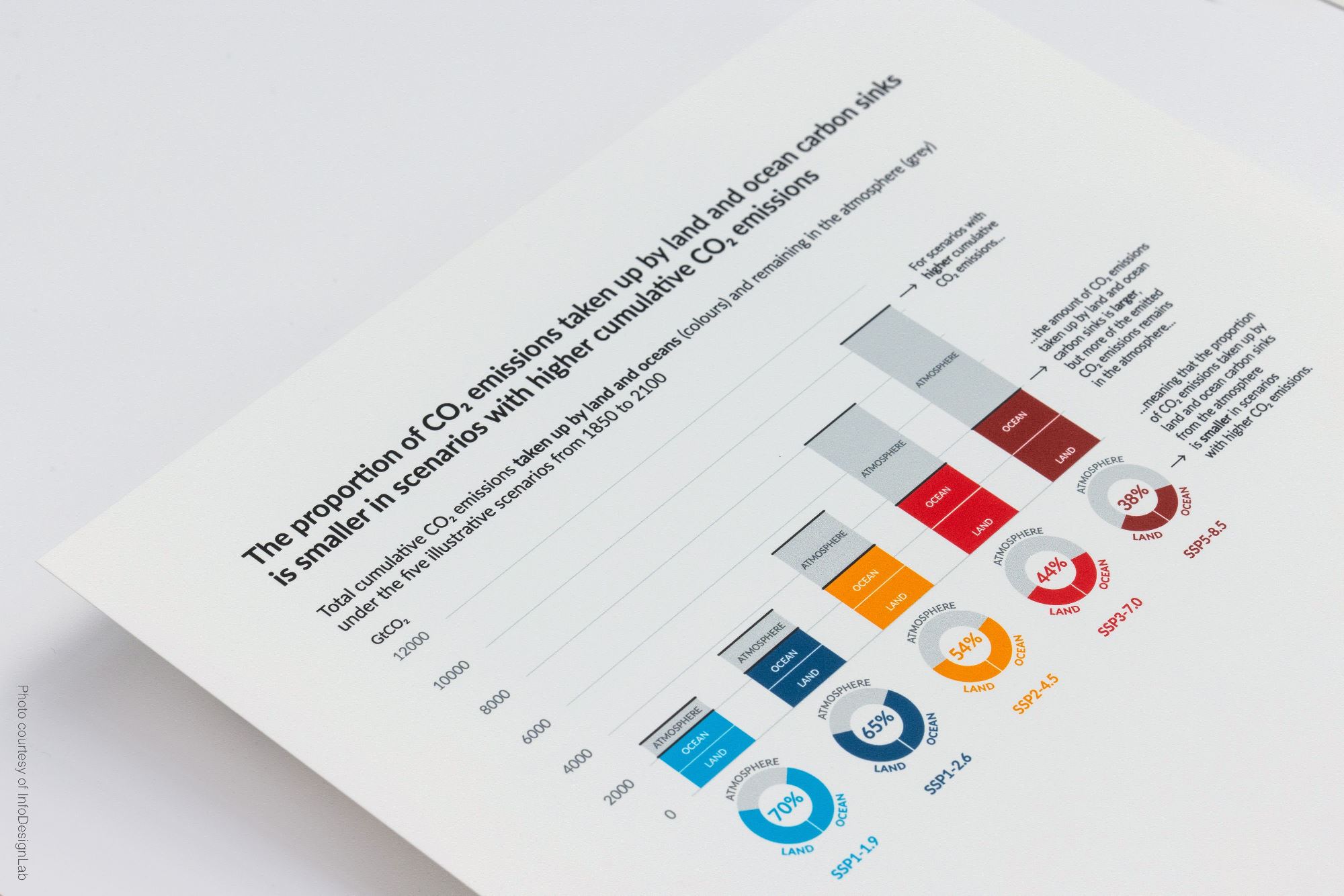
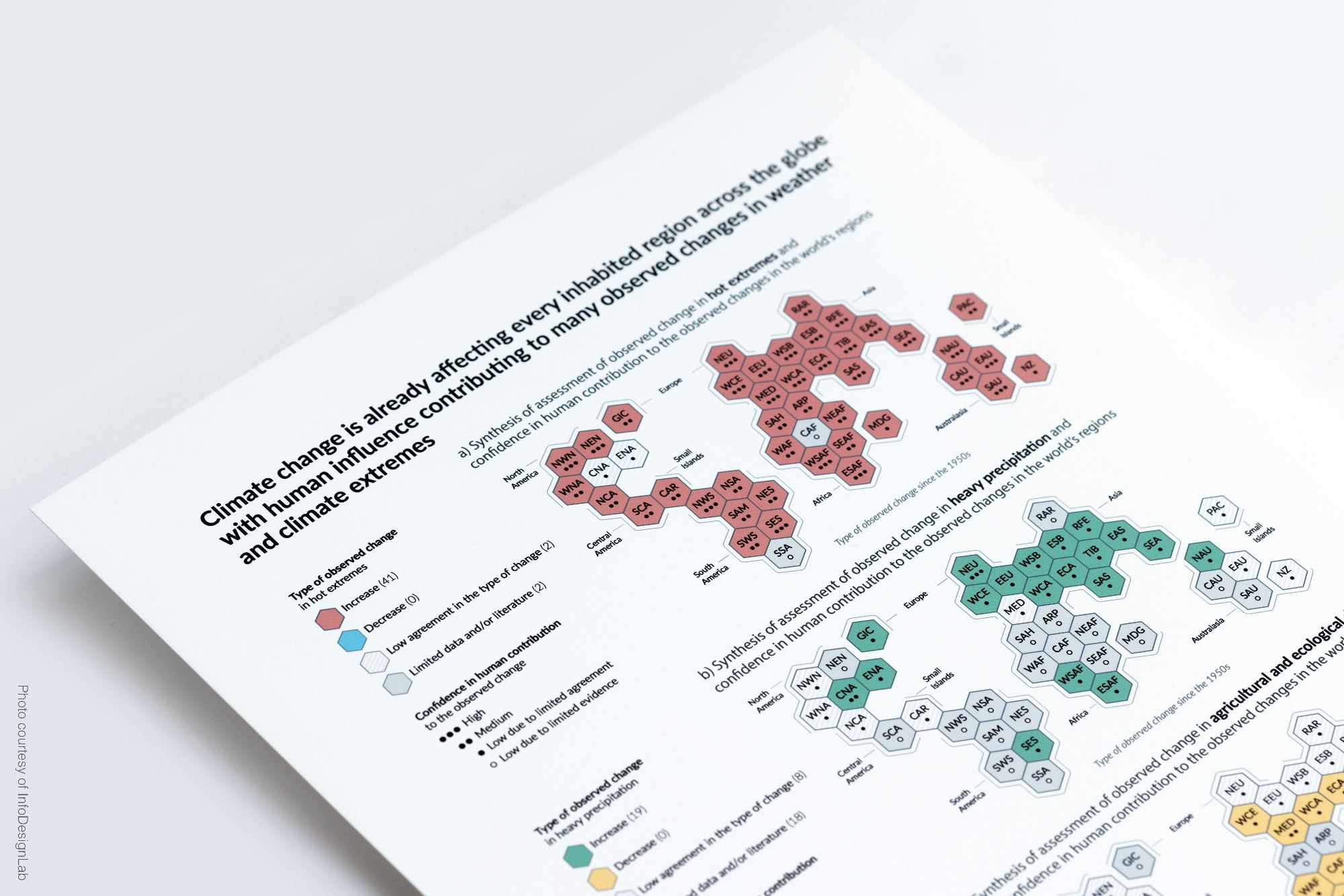
Data visualizations of the Summary for Policy Makers of the IPCC AR6 Climate Change 2021: The Physical Science Basis, by InfoDesignLab
Angela Morelli was an invited speaker at the event “Voices of the transition. Climate change communication for a sustainable future”, promoted by the CMCC Communication Award Rebecca Ballestra to gather international climate change communication experts and ideas in a new global platform that collects the foremost projects increasing climate awareness.
At the event, Morelli shared her experience as an information designer and co-designer of the data visualizations of some of the most recent Summaries for Policy Makers published by the IPCC, the Intergovernmental Panel on Climate Change, the United Nations body that assesses the science related to climate change.
Watch the full video of her speech:
From data to change
Between scientific data and their visualizations, there is a process of translating data into information. Participation makes this design process effective, involving many actors, from the scientists and experts to other stakeholders, designers, and cognitive scientists working together to meet the audience’s needs.
“The word co-design is probably the best word to describe the way we work” explains Morelli. “We borrow tools from systemic design, service design, and cognitive science, and we bring them into the information design and data visualization space. On the one side we have the audience, and on the other side we have the authors of the data: the scientists. As designers, we need to dive into the content with guidance of the content experts. We need to build a deep and shared understanding of the nature of the data and the science that underpins it. These two actors are the most important players if our goal is to turn data into information, presenting it in a way that becomes knowledge in the mind of the users, and ultimately inspire change.”
Co-designing data visualizations for the IPCC reports
Tom Johansen and Angela Morelli are among the draft authors of the Summaries for Policy Makers of three recent IPCC reports, contributing to the visualizations that are part of the publications, namely: the Special Report: Global Warming of 1.5°C (2019), the Special Report on Climate Change and Land (2019), and the AR6 Climate Change 2021: The Physical Science Basis (2021).
In the rigorous process of preparation of an IPCC report, visualizations are reviewed and approved by experts and governments, following the long, rigorous, and highly participatory process reserved to all the other materials of the publication, which is subject to detailed and line-by-line discussion. The Summary for Policy Makers of an IPCC report is approved when there is an agreement among the participating IPCC member countries, in consultation with the scientists responsible for drafting the report.
“The work of the scientists is put under a microscope, including the visualizations we co-design with them,” explains Angela Morelli. “Of course, there are country politics and national interests at play, but the scientists are there to make sure that any changes to the visualizations or texts do not undermine, misinterpret or in any way compromise the science. The visualizations had to be approved word by word, millimetre by millimetre […], enabling the scientists to take ownership of the visualizations, and allowing the delegates to see them as a result of their own work, because of the co-creation process in the review rounds.”
Has everyone appreciated how much improved the #IPCC SPM graphics are compared to previous Assessment Reports? You mainly have @angelamorelli @tomhal99 @MelichatGo & @jordanharold to thank for the designs, along with all the Authors on the figure teams.👏https://t.co/1Y62VRhLcm pic.twitter.com/rhoPd44JYY
— Ed Hawkins (@ed_hawkins) August 10, 2021
To record the history of the visualization of the reports, the information designers shared with those involved in the process a “slide book” for each visual, where they kept track of its evolution, change after change.
“The policy makers are the audience and it’s hard to imagine how a data visualization could be more tailored to an audience’s needs than in this process,” adds Morelli, who is lead author of a peer reviewed article on the application of the co-design approach in the IPCC context.
“The world’s policy makers gave their stamp of approval to these visuals. By the end of the approvals, the delegates co-owned the visualizations too. Each one of the visualizations represents a lasting tool, not a one-time impression. We hope this will form the basis from which to start a discussion around action.”
Listen to the podcast “Visualizing Global Warming with IPCC” with Angela Morelli and Tom Gabriel Johansen: